Skip to project
RELIX

Website Design & Development

Groweva

Creative Studio Website

I designed and built Groweva’s website in Figma, WordPress, and Elementor. I wanted it to feel like a creative studio from the first screen while making it easy to see what Groweva does, browse the work, and start a project.

Groweva creative studio website in desktop browser and phone frames
Groweva | Creative Studio Website · Groweva
Project
Creative studio website
My role
Web design, visual direction, and Elementor development
Deliverables
Responsive website, browser prototype, and desktop, tablet, and mobile wireframes
Tools
Figma, WordPress, Elementor, HTML, CSS, JavaScript, and Lottie

Giving visitors a clear place to start

I designed the homepage for small business owners and founders looking for help with their brand or website. I wanted them to find answers to a few simple questions. What does Groweva do? Is the work a good fit? What would it be like to work together?

I gave visitors two choices at the top of the page: Start a project or Explore the work. The selected projects show what the studio can do, and the services section explains what it can help with. Farther down, the process and FAQs cover practical questions people might have before getting in touch.
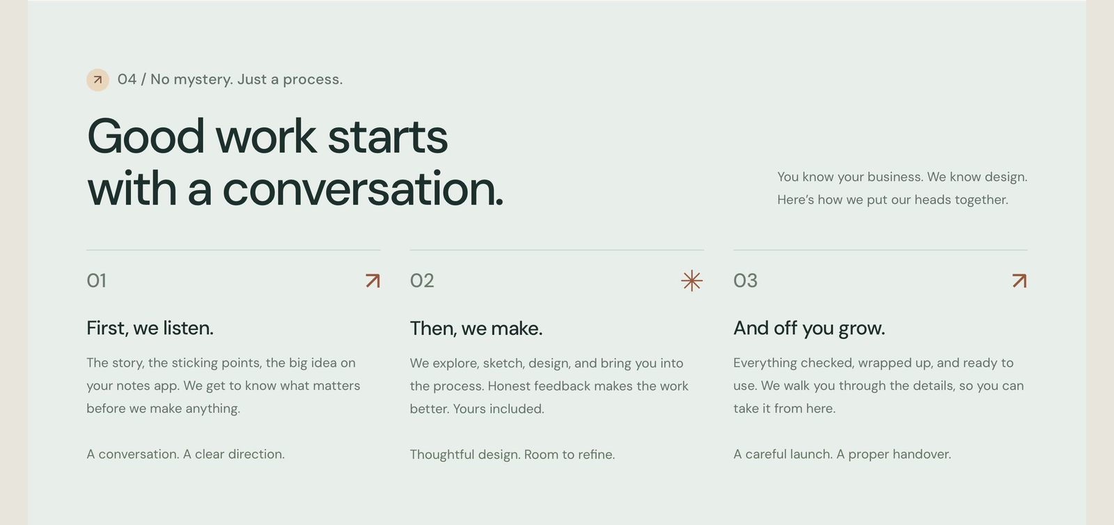
Groweva three-step process section
Explaining the working relationship through three clear steps · Click to enlarge

Finding a look that felt like Groweva

I started with a purple palette, but it felt too close to one of my references. I switched to warm ivory, deep teal, and burnt orange. I used teal behind the selected work so the artwork had a distinct section of its own, and saved orange for buttons and highlights.

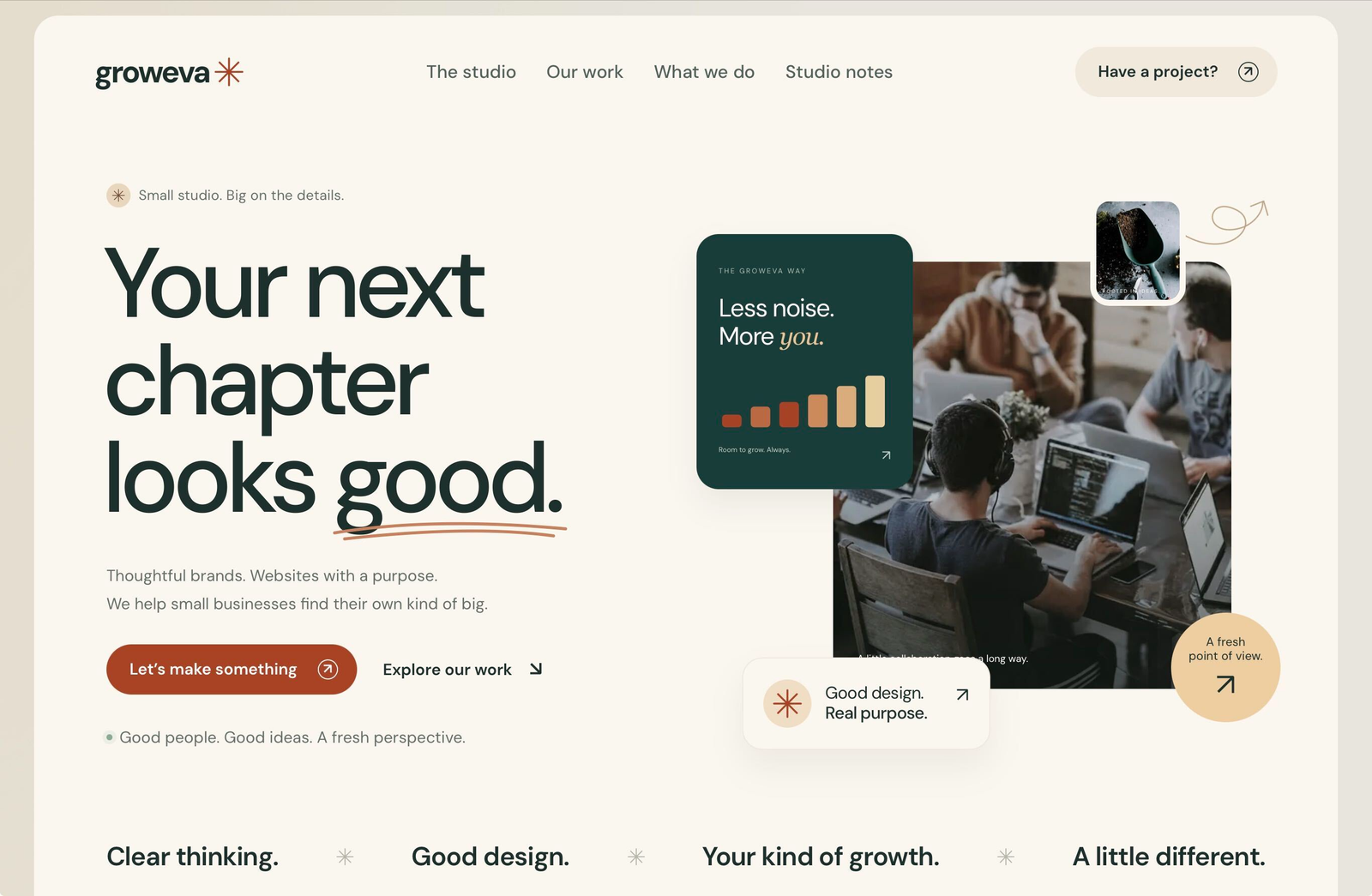
The hero took a few passes too. I liked how the photo, growth chart, and smaller cards overlapped, but the tilted cards made the small text harder to read. I straightened them and kept the overlaps. I also bumped the body copy to 16 px and the navigation to 18 px so the supporting text could hold its own alongside the big headlines.

Groweva studio introduction with sage background and layered artwork
Warm ivory, soft sage, deep ink, and layered imagery · Click to enlarge
Groweva desktop hero with headline and layered growth artwork
The final desktop hero composition · Click to enlarge

Showing more than the finished images

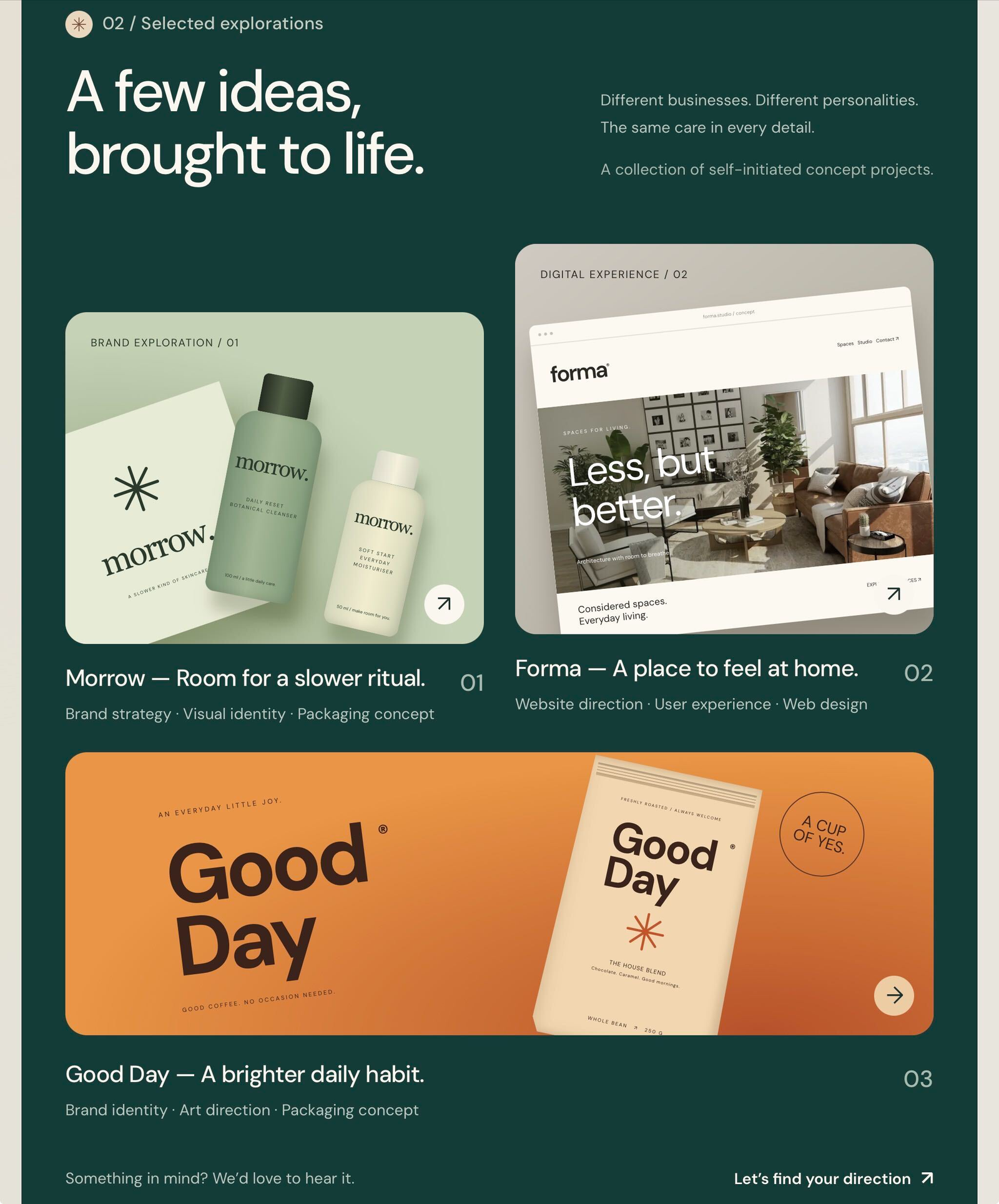
I used three projects to show the range of work: Morrow for skincare branding and packaging, Forma for architecture web design, and Good Day for coffee branding and packaging.

I kept the card structure consistent across all three. Each card also opens a short project story, so visitors can browse the visuals quickly and get more context on the work that catches their eye.

Groweva Morrow Forma and Good Day selected project cards
Selected explorations with a consistent project-card structure · Click to enlarge

From Figma to Elementor

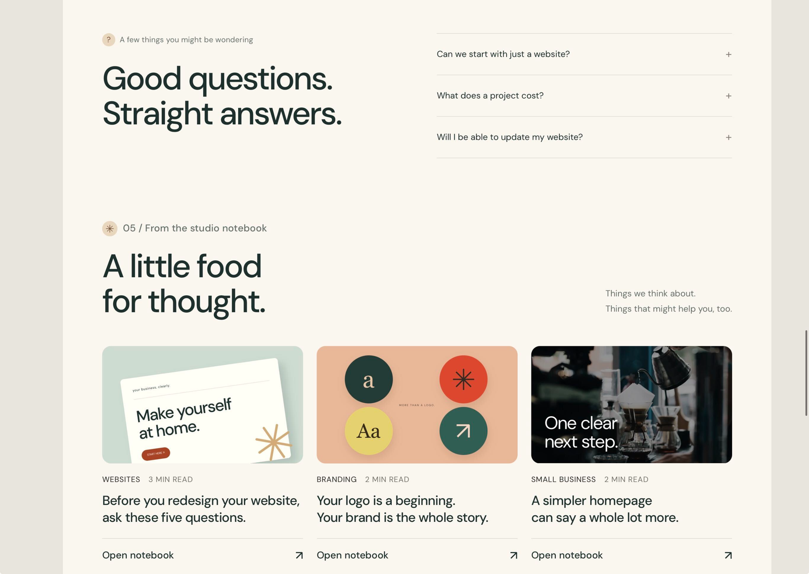
I used Figma as the design reference and built a browser prototype to see how the page behaved. That let me try the hero entrance, FAQ accordions, and project popups before carrying the design into WordPress and Elementor.

I made three Lottie animations for the prototype: a rising growth chart, a drawn arrow, and a slowly turning star. The prototype pauses motion when it’s offscreen or the tab is hidden, and shows still artwork when visitors prefer reduced motion.

Groweva FAQ accordion and studio notebook cards
Practical questions and additional design thinking · Click to enlarge

Wireframes and responsive checks

The wireframes show how the homepage is arranged at 1440 px, 1024 px, and 390 px. On smaller screens, the hero text and artwork stack, the navigation becomes a compact menu, and the project cards move into a single column.

While checking the layout on an iPad, I noticed the star symbols were showing up as green emoji. I replaced them with SVGs so the stars kept their intended shape and color. That’s the kind of detail I only caught by looking at the page outside the desktop layout.

Groweva phone view showing responsive hero and compact navigation
The supplied mobile view · Click to enlarge
RESPONSIVE STRUCTURE

Wireframes across three screen sizes.

Desktop, tablet, and phone wireframes show the page structure, content hierarchy, and how the layout adapts across devices. Scroll within each frame to explore the complete page, or select an image to enlarge it.

Groweva desktop website wireframe at 1440 pixels wide
Desktop wireframe1440 px · Scroll or click to enlarge
Groweva tablet website wireframe at 1024 pixels wide
Tablet wireframe1024 px · Scroll or click to enlarge
Groweva phone website wireframe at 390 pixels wide
Phone wireframe390 px · Scroll or click to enlarge

The finished website

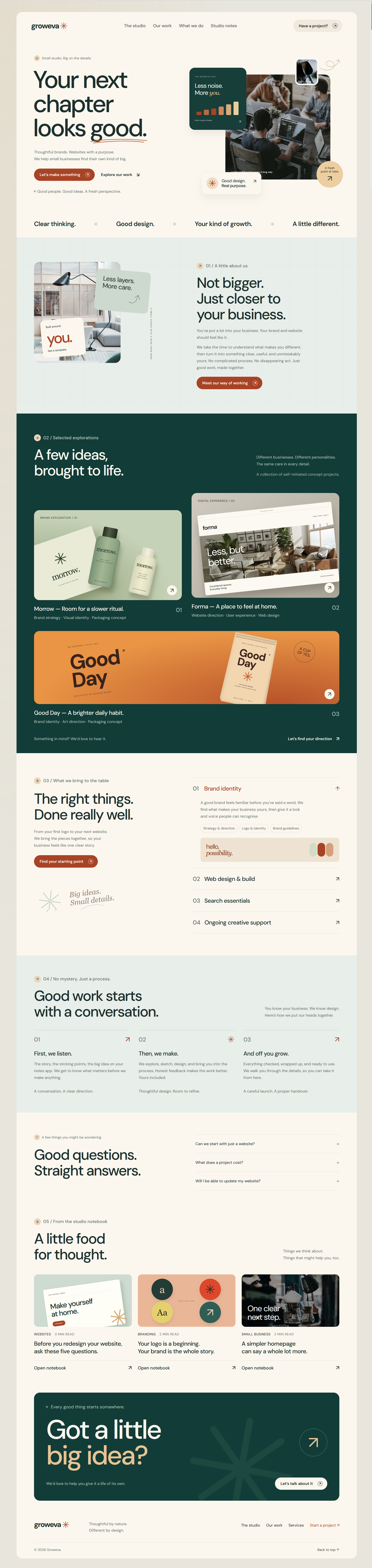
The finished Elementor site gives Groweva a place to introduce the studio, explain its services, show selected projects, and invite enquiries.

What I’d carry into the next build is simple. I’d settle the reading order and how the page should stack on mobile earlier. Those decisions made it easier to carry the design from Figma into Elementor and spot what needed adjusting once I could see the page in a browser.

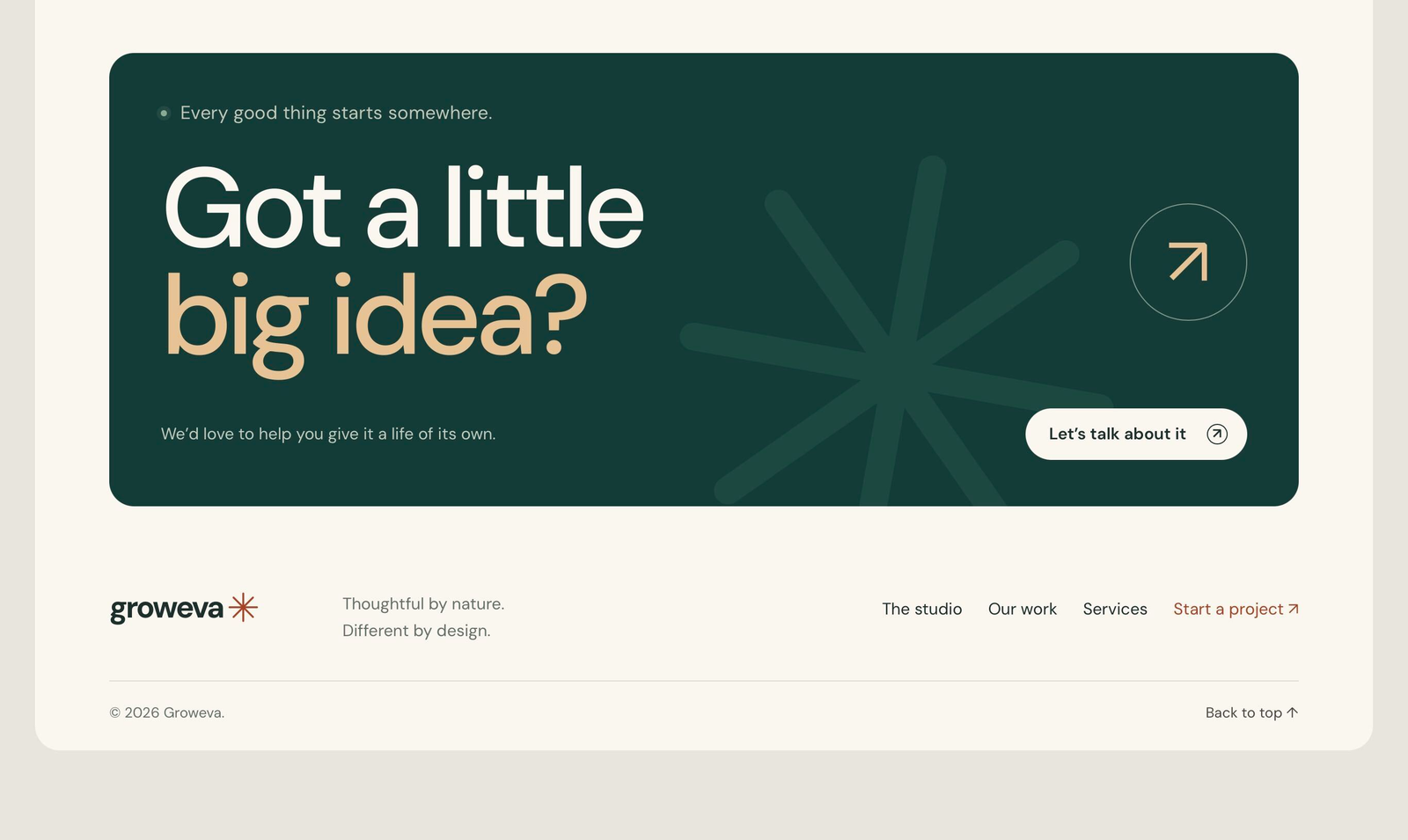
Groweva deep teal contact panel and studio footer
The final invitation to start a conversation · Click to enlarge
THE COMPLETE WEBSITE

A complete studio experience.

Scroll inside the browser frame to explore the full homepage, or select it to enlarge the supplied screenshot.

Visit groweva.com

A distinct website for your business.

Let’s discuss your website, visual direction, and the experience you want to build.

Discuss your project