Have a logo or branding project in mind?
I can help with your logo, visual identity, and brand applications.
Discuss your project RELIX
Logo Design & Visual Identity
A colorful M with room to become something more.
Logo design and visual identity for MetaBrandKit, a seller of editable design templates on Etsy.
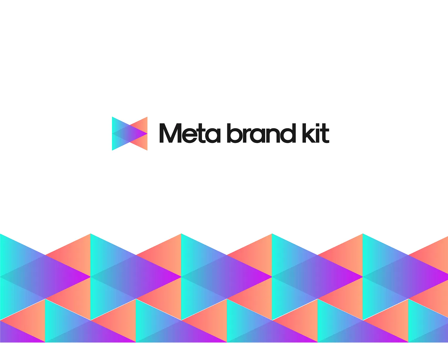
MetaBrandKit sells editable design templates on Etsy. I wanted its identity to feel creative and playful, with a mark that could work across different designs.
The letter M gave me a starting point. I built it using overlapping geometric shapes, then used color to bring the pieces together.
The M is tucked into the shape. The two outer vertical edges and the diagonals meeting toward the center give it that letter structure.
At the same time, you can see two opposing triangles. Their overlap creates a diamond in the middle, adding another shape within the mark.
That’s my favorite part. At first, you see a colorful symbol. Look a little closer, and the M starts to appear.
Turquoise blends into blue and purple, while coral brings warmth to the other side. The gradients help show how the shapes overlap and give the mark a layered feel.

I kept the wordmark simple. The black lettering makes the name easy to read beside the colorful symbol.
The white space gives both parts room to breathe. It also lets the colors stand out without needing more decoration around them.

This was the part I enjoyed most.
Repeating the shapes turns the small M into a larger graphic. The angles connect across the layout, creating a pattern that still feels connected to the logo.
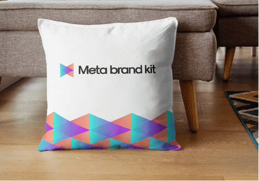
On the tote and pillow, the pattern runs along the bottom while the name sits above it. The cup uses a smaller band around its base. On the hoodie, the mark stands on its own.
I liked having that flexibility. I could use just the symbol, the full logo, or a larger section of the pattern depending on the space.
I presented the identity through hoodie, tote bag, takeaway cup, and pillow mockups. These show how the logo and pattern could work at different sizes and on different surfaces.
Brand applications shown through mockups.
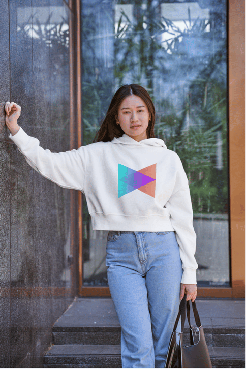
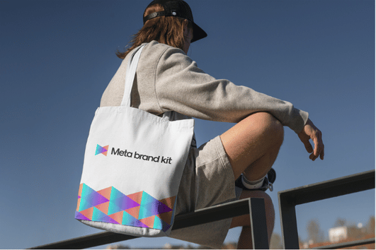
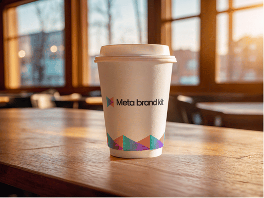
The M gives the mark a connection to the name, and the repeating shapes give the identity more ways to show up.
It’s a small detail in the logo that becomes a much bigger part of the design. That’s what makes this one enjoyable for me.
I can help with your logo, visual identity, and brand applications.
Discuss your project