Need a logo that works at any size?
I can help design a mark and visual identity that work across your website, product, and social profiles.
Discuss your project RELIX
Logo Design · Brand Identity
A visual identity concept built around an S mark that scales from a portfolio cover to a browser tab.
I redesigned the Softwaresify logo around a mark that could stand on its own. The project explores how the same identity works in a full wordmark, an app tile, and a favicon.
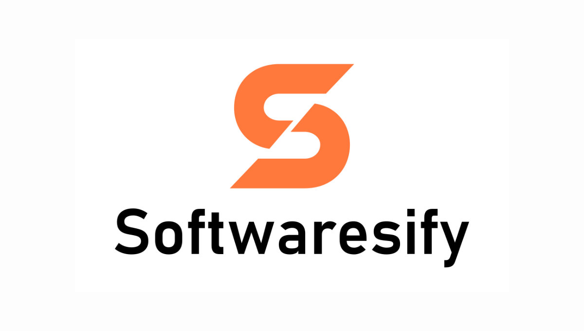
I built the S from two mirrored shapes. The rounded curves give it a clear outline, and the diagonal gap keeps the two halves distinct. I kept the shape simple so it would still read at favicon size.

I carried the original orange, blue, and teal into the redesign. Signal Orange gives the icon a strong accent. Midnight and Canvas give the wordmark contrast on dark and light backgrounds, while Circuit Mint highlights small details in the workspace mockup.


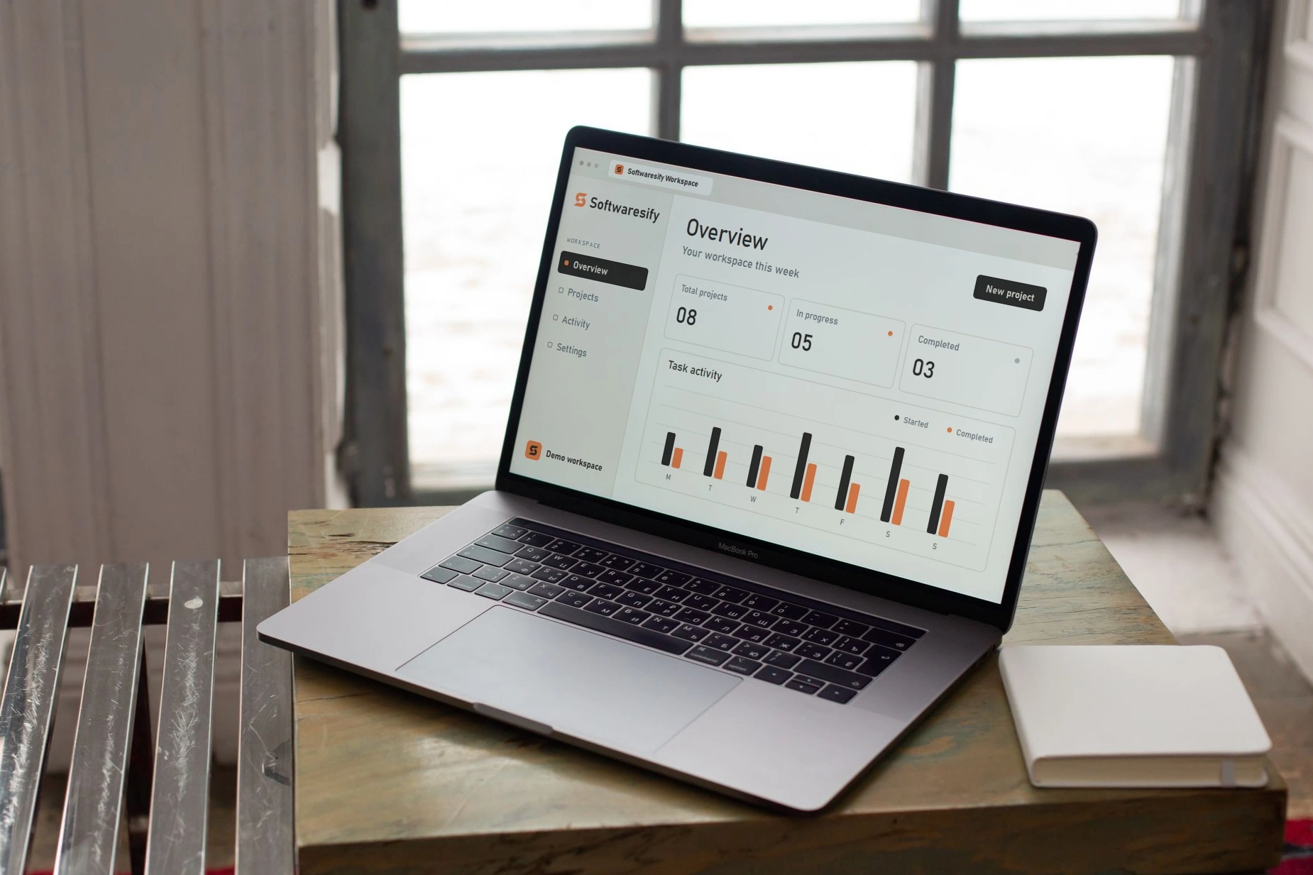
The full wordmark sits in the sidebar of a sample software workspace, where there is room for the name. The S appears on its own in the profile avatar and browser tab, where space is limited.
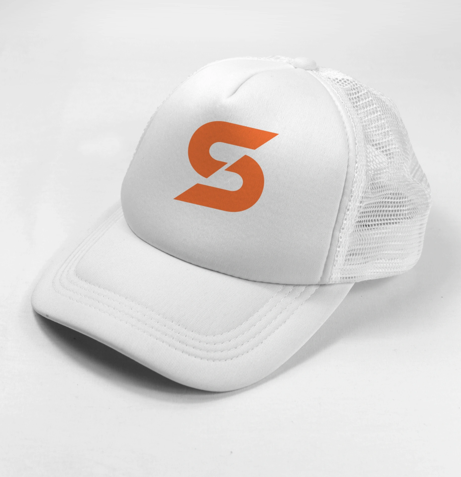
The standalone mark also carries through to merchandise, including a mug, a cap, and a T-shirt.


I can help design a mark and visual identity that work across your website, product, and social profiles.
Discuss your project