Have a logo project in mind?
I can help you turn the idea behind your project into a logo that feels right for it.
Discuss your project RELIX
Logo Design & Visual Identity
A logo for a devotional website, built around the shape of an open Bible.
I designed VerseNest for a website idea centered on Bible verses and devotionals. I wanted the logo to feel at home next to a short reading someone could come back to each day.
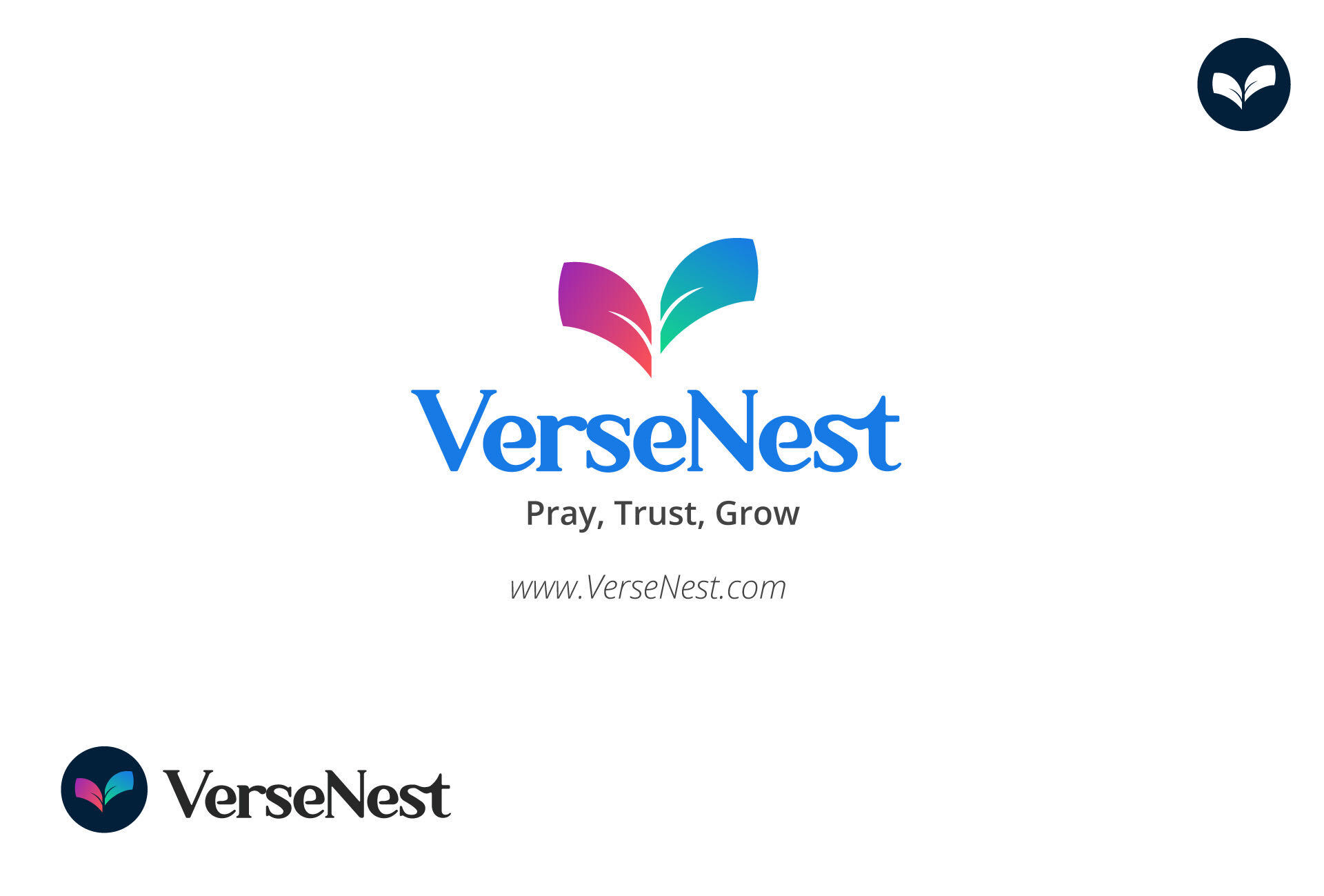
I started with the V in VerseNest. I shaped each side of the V like a page, so together they look like an open Bible. The thin white lines inside the pages represent a verse written on the page, tying the mark back to the name and what people would come to the site to read.
If you look closely where the two pages meet, the white space also suggests the cross of Jesus Christ. I kept that detail subtle so the V and the open Bible come through first.
I used magenta and coral on one page and blue and teal on the other. The two sides have their own colors, and the center fold brings them together. I paired the mark with blue serif lettering to give the name the familiar feel of a book title.
The stationery mockups show the full logo on a white card, where there’s room for both the symbol and the name. For the small envelope seal, I used the mark by itself. The cup mockup shows that same mark at a larger size, where the details are easier to see.

I can help you turn the idea behind your project into a logo that feels right for it.
Discuss your project