Need a logo or visual identity for your brand?
I can help you design a logo and build a visual identity that works across your website, social profiles, and print materials.
Discuss your project RELIX
Logo Design & Visual Identity
A simple W with a small detail that makes it Weblerr.
I designed the visual identity for Weblerr, a creative brand starting with web design and development, with room to grow into branding, graphic design, and UX/UI. I wanted the logo to feel at home on a website today and still fit as the brand takes on different kinds of work.
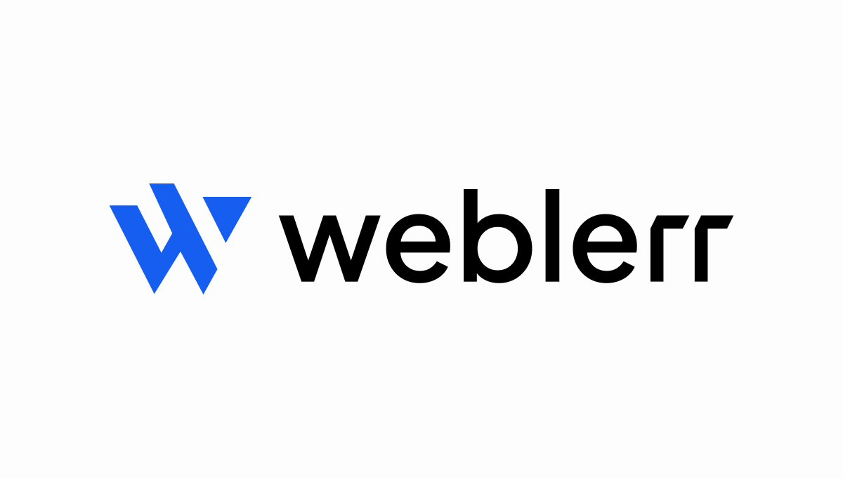
The first letter gave me a starting point. The fun part was seeing how much of the W I could take away and still have it read like a W.
Wide diagonal strokes give the W its shape. The two sharp points at the bottom make the letter easy to pick out, and the small triangle in the upper right sits where you’d expect the last stroke to end.
That gap is my favorite part. Your eye connects the triangle to the rest of the letter, even though the pieces never touch. It’s a small detail, but it changes how the whole mark feels.
The triangle follows the same sharp angles as the rest of the mark.
I kept the wordmark lowercase. The round letters soften the sharp W, and the angled ends of the two r’s bring a bit of that geometry back into the name.
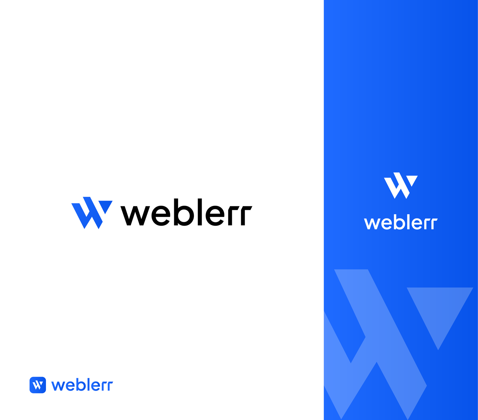
The horizontal logo gives the name room to breathe. The stacked version fits a narrower space, and the W can stand on its own inside a rounded square. I also used a cropped, oversized W as a background graphic so the shape could do more than sit next to the wordmark.


I wanted to see how the same mark would feel on things you could actually hold or wear. The cap gives the W a small space of its own. The shirts let me see it against light and dark fabric, and the tote makes room for the oversized graphic.


Even when the name drops away and all that’s left is the icon, that little triangle is enough to make it feel like Weblerr to me.
I can help you design a logo and build a visual identity that works across your website, social profiles, and print materials.
Discuss your project